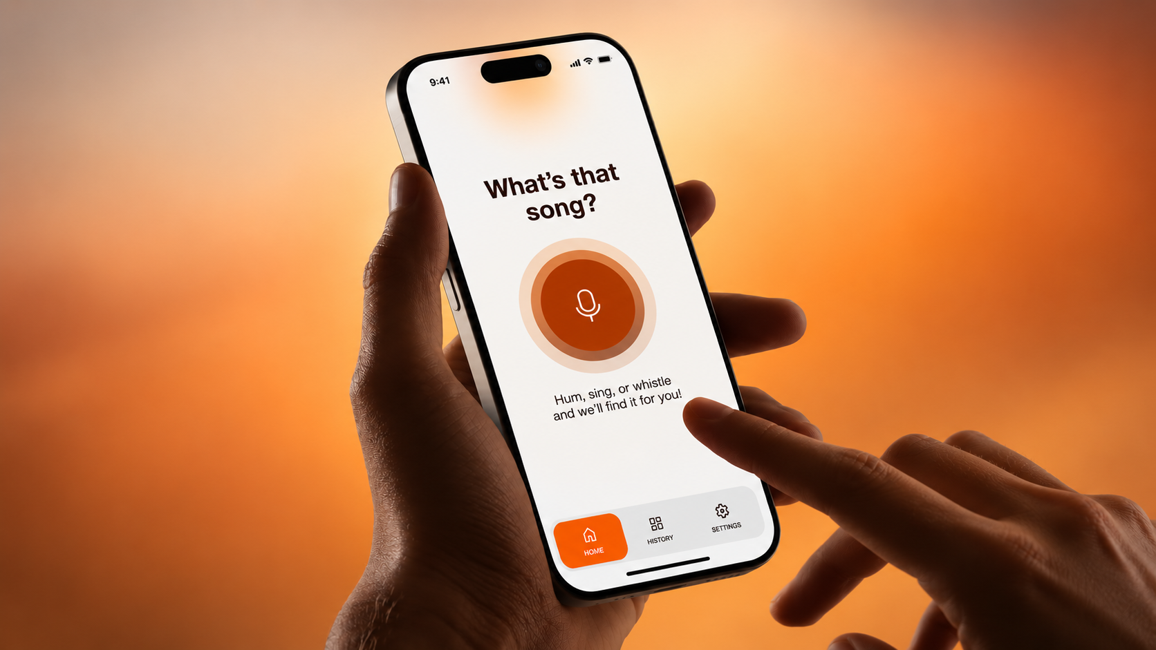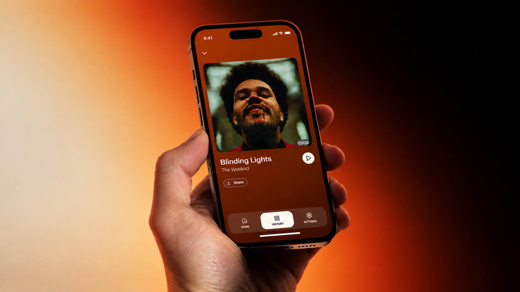
Overtone is a music recognition app for the moment a song catches your attention and you want to know what it is. With one tap the app starts listening to the music nearby, and you can also hum, sing or whistle the melody.
I worked on Overtone in a design team and took part in every stage, from the first user flows to the file handed over to development. The project shows the full path I take with a client's idea: concept, identity, a design system with components, screens, prototype and a handoff developers can build from.
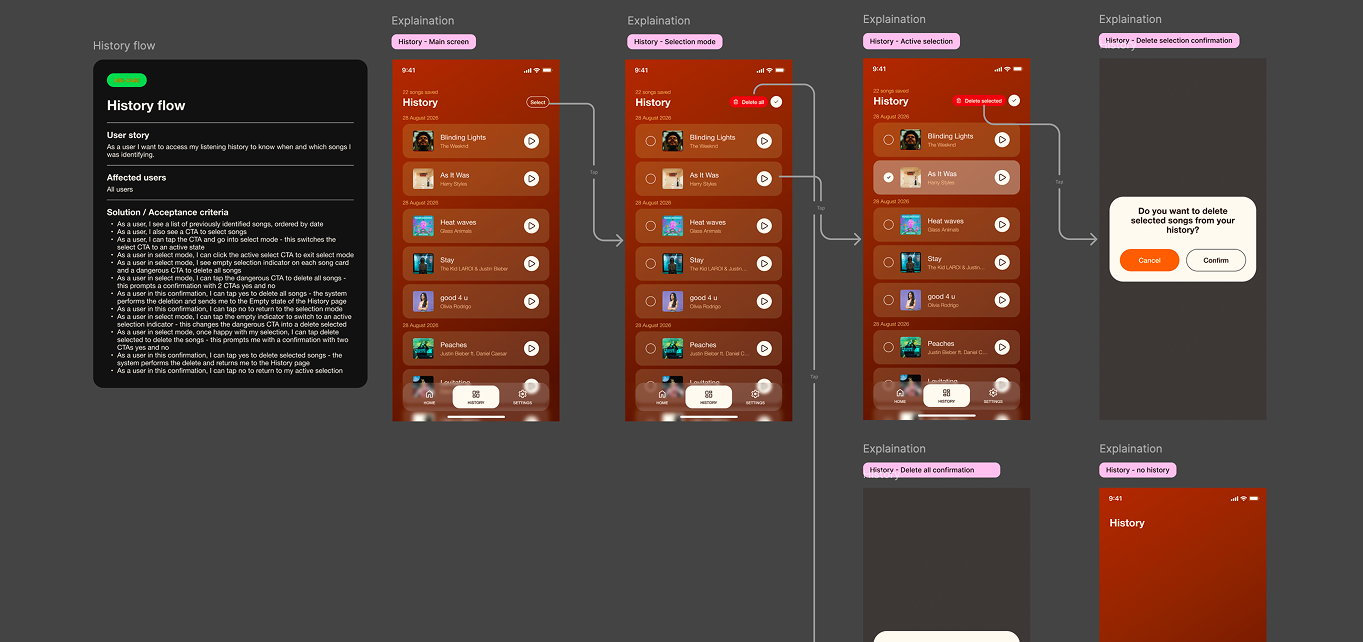
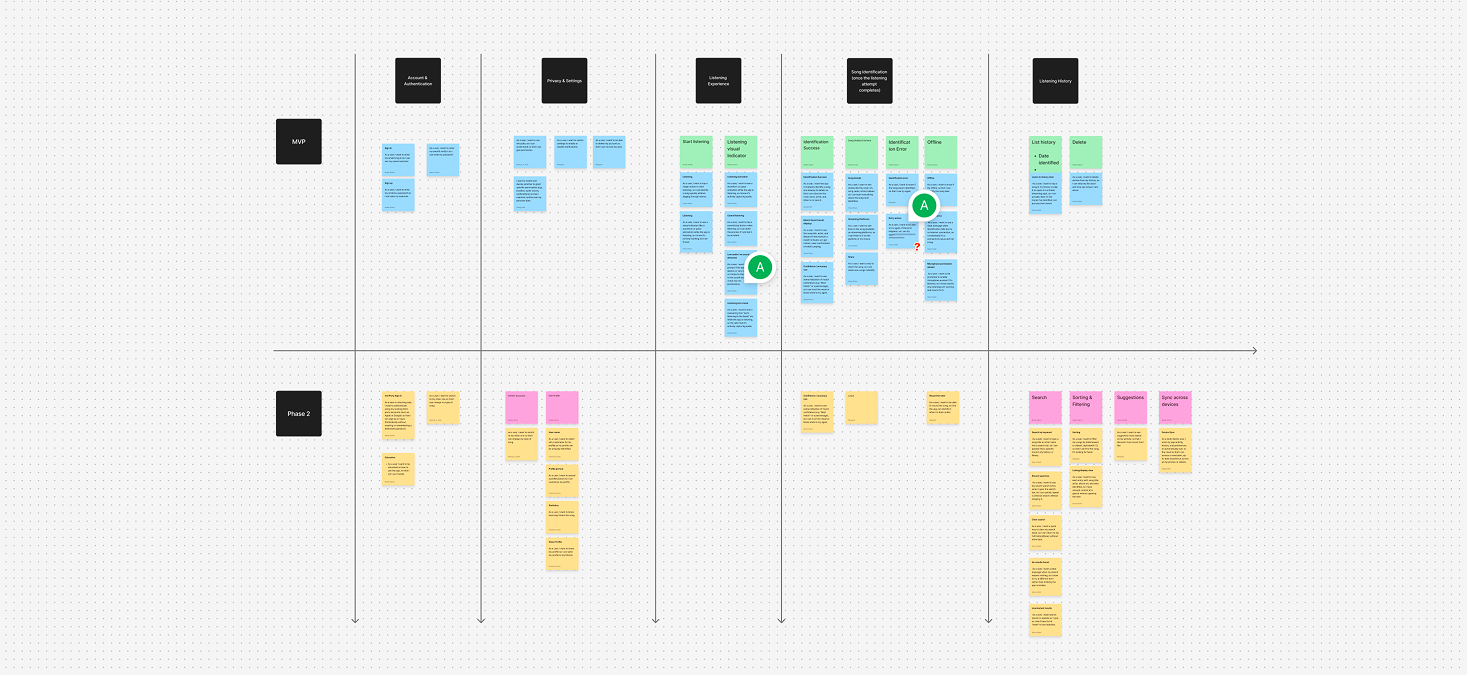
We started by deciding what the first version needs. We mapped the information architecture and user flows in FigJam and wrote a user story for each flow, from identifying a song to History, Settings and the account. Edge cases got their own flows too, so the app has an answer for a denied microphone, no internet or a song it couldn't find.
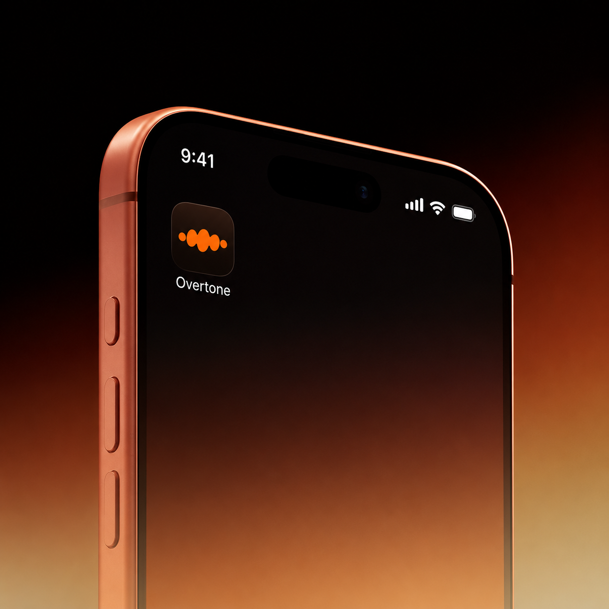
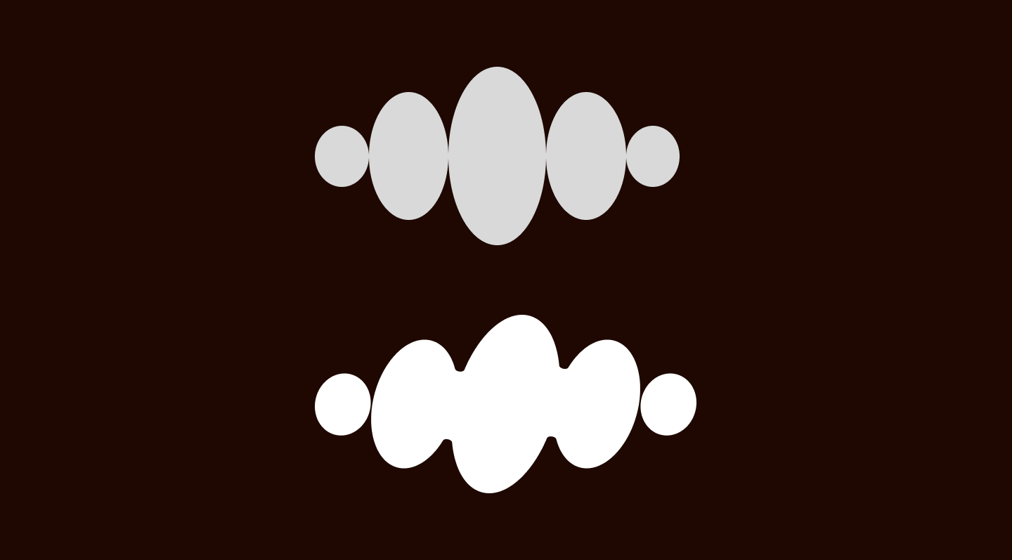
Our idea was to keep it simple but stylish. The logo is an orange sound wave in soft, rounded shapes that grows from small dots into full waves, like a melody the app is catching. A small warm palette of bright orange, deep brown, rust and off-white carries it through the whole app.
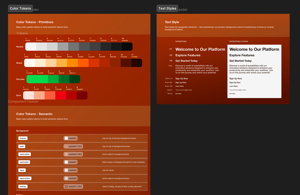
We turned the identity into a design system in Figma: semantic color tokens and reusable components with variants, from buttons and input fields with all their states to song cards, dialogs and the tab bar. Every screen is assembled from these components, so the app stays consistent and a change in one place updates it everywhere.
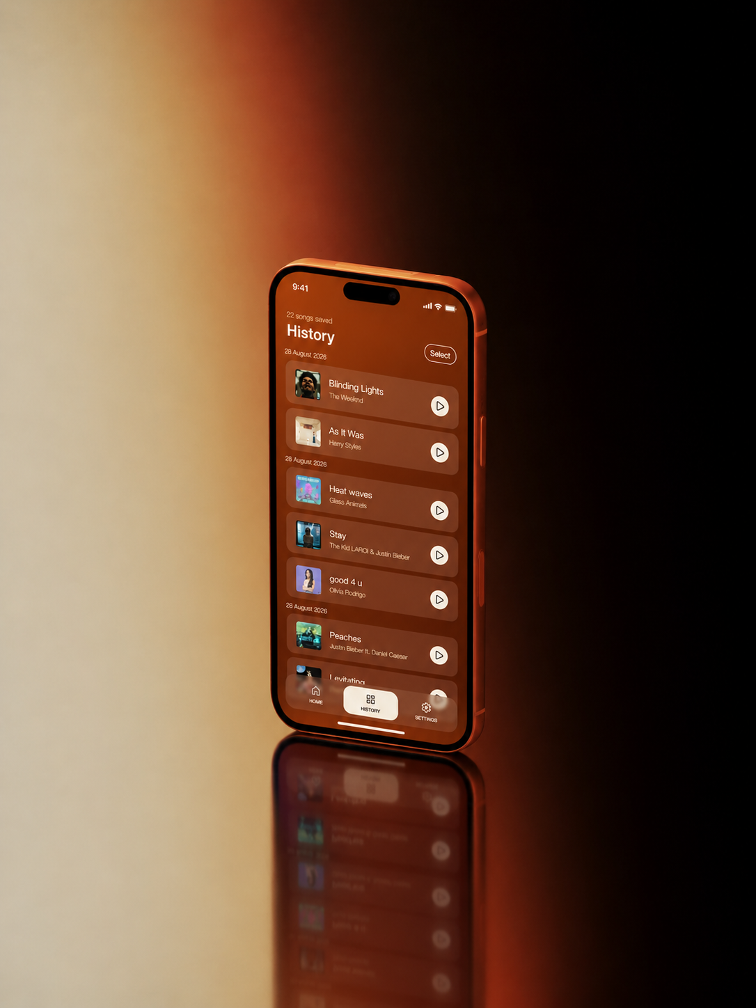
We designed the screens for every flow and state: listening, the song page, History, Settings, the account and the error screens. Home and account screens stay light, while the song page, History, Settings and errors sit on a rust gradient, so the whole app follows the same visual logic. Each frame is built on Auto Layout, so the layouts adapt to different phone sizes.
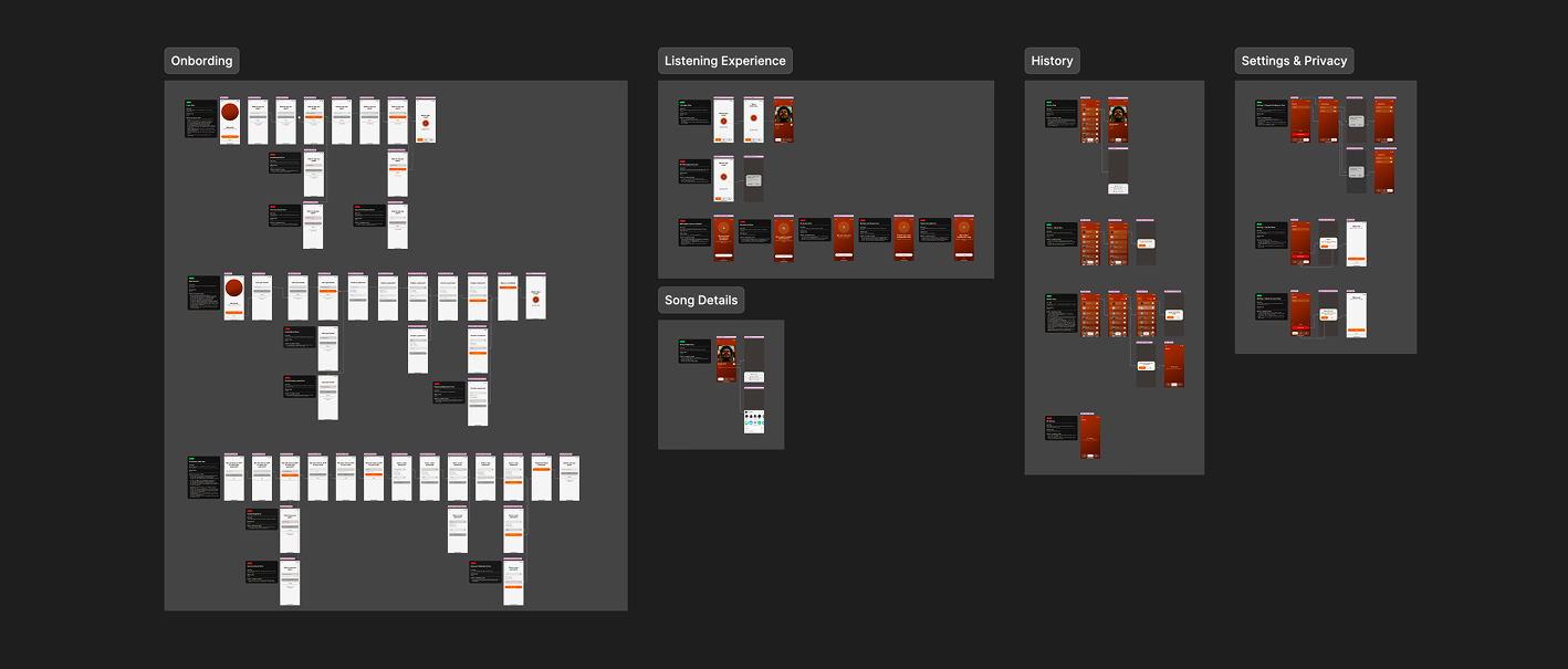
We connected the screens into an interactive prototype of the main journeys and used Figma Motion to show developers and stakeholders how transitions and states should move.
The file is ready for development: each flow starts with a card holding its user story and acceptance criteria, every screen is labeled with its name and state, and arrows show whether a tap or a swipe leads to the next one. A developer can open any screen and see which component and token each element uses.